Review of Mujhe Kucch Khena Hai
Introduction
This could be Satish Kaushik’s worse film after Prem and Roop Ki Rani Choron Ka Raja, and the storyline above just shows how much imagination has gone in the screenplay. The film also has one of the dullest and crass performances from most of the star cast, with only Amrish Puri shining in his role as the loveable uncle, and Kareena Kapoor trying to do her best with the abysmal screenplay and lifeless direction.
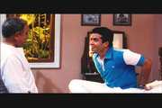
I must talk about this new star Tusshar who to me lacks presence, acting, and looks. Although looks aren’t an issue to me (otherwise I wouldn’t watch many South Indian films), acting skill is and this actor has none. The fact that he is just a big star (Jeetendra) son is a plausible fact for him to star in a big budget movie?
The acting training schools he went to let him down, as he is unable to convince me of the role of a man pinning to say the rights words to ask a girl out. With lack of emotional response & wooden expressions I don’t see this actor go far unless he brushes up fast. He should learn from his other colleagues like Hirthik Roshan, or even Kareena Kapoor his co-star in this film!
Music is a strong point, and has become one of Anu Mailk’s underestimated score of the year. Here the music is both soothing and memorable. While technical values are good but not as good as other movies seen this year. The film also has a rushed look to it and feels incomplete at times. This suggests that some scenes were cut out to satisfy the fat distributors and exhibitors out there. What ever happened to presenting the film in the director’s original vision, weather the film is 2 hours long or 4 hours long the final say should be the directors.
Unfortunately this film has become a big hit in India, UK and USA and all I can say that I am largely beginning to worry about Indian audiences and their choice of films! But its nice to see the usual conventions still going strong in Indian cinema, but it should be presented in a respective or innovative way everytime and this is where the film fails.
Video
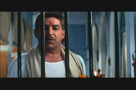
The DVD is presented in a non-anamorphic letterbox ratio of 1.85:1, which has been cropped from its original theatrical aspect ratio of 2.45:1. The cropping has an effect on the way the film has been presented and it shows severely on this DVD. Sides of the frame are missing and it is quite evident at times. Also the cinematography, which was spared no expense, is wasted on this disc as the full effect is lacking. Indeed Video-Sound has really messed up here, and I say that in the best possible manner!
The 35mm print negative source used for this DVD appears to be in okay condition. But from the start is it clear that the 35mm print used was from an ordinary cinema print, and not a copy from the interpostive print which would have been far more clearer and defined in quality. Little wear and tear can be found in some scenes but not as bad as expected from a 35mm cinema print.
The DVD had small problems like compression artefacts and some instance of grain was detected. Again this is due to the highly rushed job by a company which doesn’t understand the DVD format, and I can say this as if they did understand the format then encoding problems would have never occurred. Yet the encoding problems on this Video-Sound title aren’t as bad as its predecessor and shows weak signs of improvement. Shimmering and moiré effects are also seen, and can’t be ignored.
Picture detail was weak, dark definition was never present and blacks seems to be one or two toned making dark scenes harder to view. But the big disappointment was the incorrect colour saturation present on this disc and the highly reddish brown hues. The film was shot with exotic and glamorous colours that are never seen on this disc. Clearly the fault lies with the telecinst who captured the wrong colours of the film, making it seem cheap and dull.

Audio
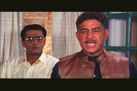
The Dolby Digital Hindi soundtrack is really poor, and is basically a mono track filled to all 5 channels (or speakers). This is odd as the film was made with an original 6 track Dolby & DTS soundtrack, so why wasn’t it present on this disc? Care for answers Video-Sound or are lacking in that department too! As a result the soundtrack on this DVD is lifeless, distorted and flat.
Features
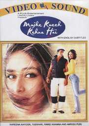
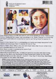
The menus static, poor and too rushed for my liking, and the same can be said for the box design, which is tacky. The English subtitles are a nice welcome, but they are not 16x9 friendly so to zoom in this film on a widescreen television means losing out on subtitles.

Conclusion
Another loser from Video-Sound, and for us audiences.














Your Opinions and Comments
Be the first to post a comment!